M4#
概要
Spyros Makridak教授チーム主催の時系列予測コンペティション, The fourth edition of the Makridakis forecasting Competitionで使用されたデータセット。100,000種類の系列が含まれており、それぞれサンプリング間隔やサンプルされたドメインが異なる。
論文: The M4 Competition: 100,000 time series and 61 forecasting methods
オリジナルデータ:
データ形式:
.csvタスク: 時系列予測
データスペック#
- データ長:
可変
- 特徴量次元:
1 (単変量)
- 系列数:
100,000
- サンプリング間隔:
Yearly,Quarterly,Monthly,Weekly,Daily,Hourly- ドメイン:
Demographic,Finance,Industry,Macro,Micro,Other
コンペのため、それぞれの系列の意味がわかるようなカラム名はついていない。 詳細情報はM4-info.csv- バリデーション:
Train/Testデータの分割されたcsvファイル
可視化#
前述のKaggleリポジトリからデータをダウンロードしていることとします。
ここではcsvファイルを ../data/M4 に配置したと想定して可視化します。
ライブラリの読み込み (折りたたみ)#
データ読み込み#
rootdir = Path("../data/M4")

df_info = pd.read_csv(rootdir / "M4-info.csv")
df_info.head()
| M4id | category | Frequency | Horizon | SP | StartingDate | |
|---|---|---|---|---|---|---|
| 0 | Y1 | Macro | 1 | 6 | Yearly | 01-01-79 12:00 |
| 1 | Y2 | Macro | 1 | 6 | Yearly | 01-01-79 12:00 |
| 2 | Y3 | Macro | 1 | 6 | Yearly | 01-01-79 12:00 |
| 3 | Y4 | Macro | 1 | 6 | Yearly | 01-01-79 12:00 |
| 4 | Y5 | Macro | 1 | 6 | Yearly | 01-01-79 12:00 |
# 各カテゴリーとサンプリング間隔ごとの時系列数
df_num = pd.pivot_table(df_info, index="SP", columns="category", aggfunc="count").get(
    "M4id"
)
df_num.reindex(
    index=["Yearly", "Quarterly", "Monthly", "Weekly", "Daily", "Hourly"],
    columns=["Micro", "Industry", "Macro", "Finance", "Demographic", "Other"],
)
| category | Micro | Industry | Macro | Finance | Demographic | Other |
|---|---|---|---|---|---|---|
| SP | ||||||
| Yearly | 6538.0 | 3716.0 | 3903.0 | 6519.0 | 1088.0 | 1236.0 |
| Quarterly | 6020.0 | 4637.0 | 5315.0 | 5305.0 | 1858.0 | 865.0 |
| Monthly | 10975.0 | 10017.0 | 10016.0 | 10987.0 | 5728.0 | 277.0 |
| Weekly | 112.0 | 6.0 | 41.0 | 164.0 | 24.0 | 12.0 |
| Daily | 1476.0 | 422.0 | 127.0 | 1559.0 | 10.0 | 633.0 |
| Hourly | NaN | NaN | NaN | NaN | NaN | 414.0 |
例として、最も軽量なデータセットの Yearly-train.csv を読み込みます。MonthlyやDailyなど他のデータも同じ形式です。
df_yearly = pd.read_csv(rootdir / "Train/Yearly-train.csv", index_col=0)

df_yearly.head()
| V2 | V3 | V4 | V5 | V6 | V7 | V8 | V9 | V10 | V11 | ... | V827 | V828 | V829 | V830 | V831 | V832 | V833 | V834 | V835 | V836 | |
|---|---|---|---|---|---|---|---|---|---|---|---|---|---|---|---|---|---|---|---|---|---|
| V1 | |||||||||||||||||||||
| Y1 | 5172.1 | 5133.5 | 5186.9 | 5084.6 | 5182.0 | 5414.3 | 5576.2 | 5752.9 | 5955.2 | 6087.8 | ... | NaN | NaN | NaN | NaN | NaN | NaN | NaN | NaN | NaN | NaN |
| Y2 | 2070.0 | 2104.0 | 2394.0 | 1651.0 | 1492.0 | 1348.0 | 1198.0 | 1192.0 | 1105.0 | 1008.0 | ... | NaN | NaN | NaN | NaN | NaN | NaN | NaN | NaN | NaN | NaN |
| Y3 | 2760.0 | 2980.0 | 3200.0 | 3450.0 | 3670.0 | 3850.0 | 4000.0 | 4160.0 | 4290.0 | 4530.0 | ... | NaN | NaN | NaN | NaN | NaN | NaN | NaN | NaN | NaN | NaN |
| Y4 | 3380.0 | 3670.0 | 3960.0 | 4190.0 | 4440.0 | 4700.0 | 4890.0 | 5060.0 | 5200.0 | 5490.0 | ... | NaN | NaN | NaN | NaN | NaN | NaN | NaN | NaN | NaN | NaN |
| Y5 | 1980.0 | 2030.0 | 2220.0 | 2530.0 | 2610.0 | 2720.0 | 2970.0 | 2980.0 | 3100.0 | 3230.0 | ... | NaN | NaN | NaN | NaN | NaN | NaN | NaN | NaN | NaN | NaN |
5 rows × 835 columns
行方向に系列名、列方向にその系列値が格納されています。Yから始まる系列名はM4-info.csvの M4idに、先頭の値の時刻は StartingDateに対応します。
よく扱う時系列の形式に合わせ、pandasで扱いやすくするために、転置しておきます(行方向に時刻、列方向に系列名が並ぶ)。
df_yearly_t = df_yearly.transpose()

# 簡単な情報
print("系列の形状: ", df_yearly_t.shape)
print("系列の最大長: ", df_yearly_t.count().max())
print("系列の最小長: ", df_yearly_t.count().min())
系列の形状:  (835, 23000)
系列の最大長:  835
系列の最小長:  13
プロット (Plotly)#
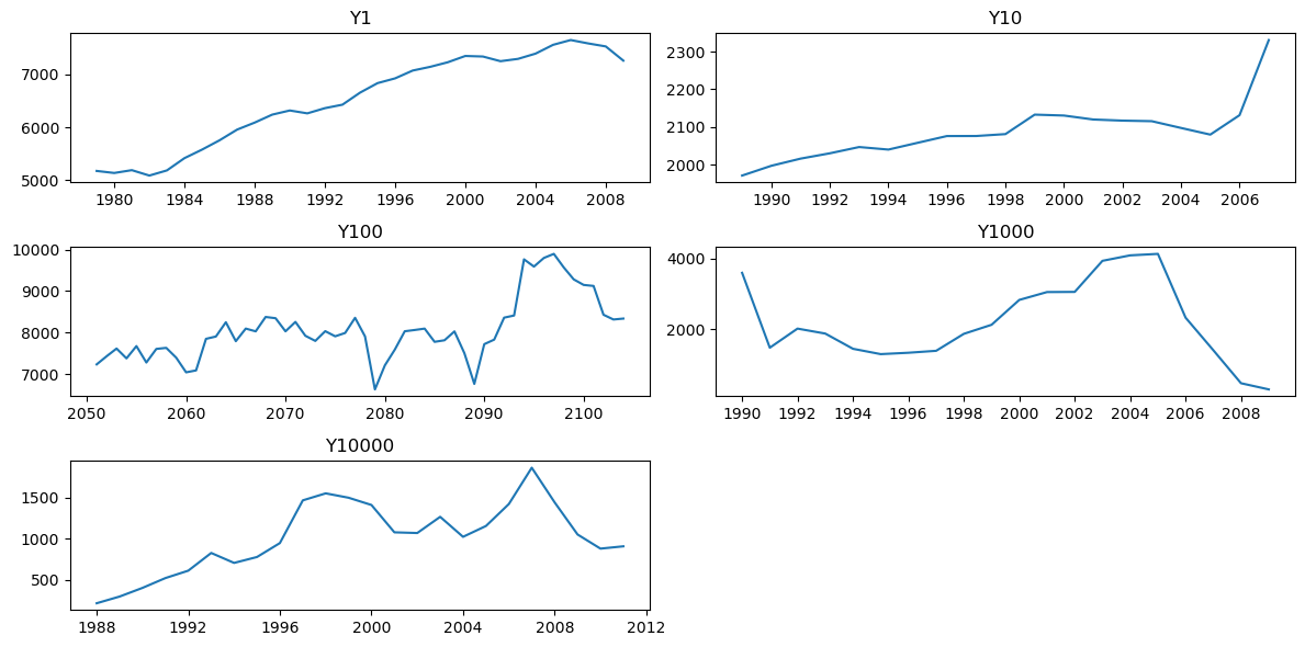
系列数が多いため、代表していくつかの系列を可視化します。
cols = ["Y1", "Y10", "Y100", "Y1000", "Y10000"]

fig = make_subplots(
    rows=len(cols), shared_xaxes=False, vertical_spacing=0.06, subplot_titles=cols
)

for i, col in enumerate(cols):
    ts = df_yearly_t[col].dropna()
    ts_st = df_info[df_info["M4id"] == col]["StartingDate"].values[0]
    ts_idx = pd.date_range(ts_st, periods=len(ts), freq="YS")
    fig.add_trace(
        go.Scattergl(x=ts_idx, y=ts, name=col, mode="lines"), row=i + 1, col=1
    )
fig.update_layout(
    autosize=True, height=800, margin=dict(l=20, r=20, t=20, b=10), showlegend=False
)
fig.show()