時系列データの可視化#
生のCSVデータはただの数値の羅列であり、そのままでは直感的な理解は困難です。グラフに描画(可視化)することで、”上昇傾向にある”, ”周期性がある”, ”変化がない”などさまざまな情報が見えてきます。Pythonでは、PythonベースとJavascriptベースのライブラリがよく用いられます(ほかにもd3jsやOpenGLベースのものもあるようです)。
Pythonベース
-
最も基本的な可視化ライブラリです。ごちきかのコンテンツでもよく利用されています。
-
matplotlibを拡張した可視化ライブラリで、特に統計的なグラフ描画が得意です。散布図やヒストグラム、箱ひげ図などを容易にプロットできます。
-
pandas自体は、主にデータの加工や集計、演算のためのライブラリですがバックエンドにmatplotlibを採用しているため、
plot()メソッドで基本的な描画を担うことができます。
-
Javascriptベース
ここでは、基本的な描画ツールのmatplotlibをつかった可視化を行います。一般的な時系列センサーデータは値の時間変化に興味があるため、まず折れ線プロットを作図します。前章で前処理済みのデータを対象とします。
matplotlibによる可視化#
matplotlibにはグラフを作る方法が主に2つあります。
pyplotインターフェース#
plt.plot()で描画していくパターンです。
plt.figure()
plt.plot(x, y)
plt.show()
1枚のグラフを手早く作成する場合に便利です。
オブジェクト指向インターフェース#
plt.subplots()や.add_subplot()を用いてAxes オブジェクトを作成し、グラフを作成するパターンです。複数グラフを同時に描画したり、二軸グラフを作成する場合、細かいレイアウトを調整したいときに利用します。
FigureオブジェクトとAxesオブジェクトの関係は下図のように入れ子構造になっています(matplotlib公式チュートリアルより引用)。 Figureがグラフ全体を、Axesが実際にプロットする場所を指しています。

Axesの作成方法は前述の通り2パターンあります
plt.subplots#
FigureとAxesを同時に作成する方法です。引数はsubplots(行数, 列数) のようになっています。
fig, ax = plt.subplots(1, 1)
ax.plot(x, y)
plt.show()
import matplotlib.pyplot as plt

%matplotlib inline

fig, axes = plt.subplots(2, 3, figsize=(6, 4))
fig.subplots_adjust(hspace=0.4, wspace=0.4)

for i in range(2):
    for j in range(3):
        # axesにはarray形式で複数のAxesが格納されている.
        # index指定でアクセス可能
        axes[i][j].text(0.5, 0.5, str((i, j)), fontsize=18, ha="center")

plt.show()
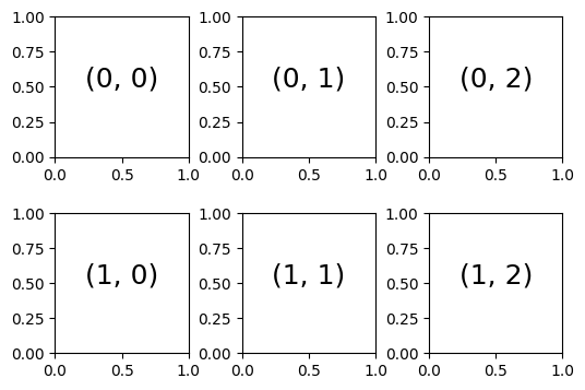
fig.add_subplot()#
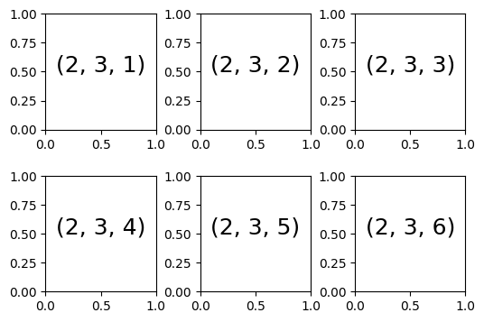
plt.figure()でFigureを作成してからAxesを追加する方法です。引数がadd_subplot(行数, 列数, 図番号) になっており、以下の図の様に左上から順番に図番号が振られています。
# 例2
fig = plt.figure()
ax = fig.add_subplot(1, 1, 1)
ax.plot(x, y)
plt.show()
fig = plt.figure(figsize=(6, 4))
fig.subplots_adjust(hspace=0.4, wspace=0.4)
for i in range(1, 7):
    ax = fig.add_subplot(2, 3, i)
    ax.text(0.5, 0.5, str((2, 3, i)), fontsize=18, ha="center")
plt.show()
時系列データの描画#
データを読み込みます。
import numpy as np
import pandas

fname = "../data/2020413.csv"
df = pandas.read_csv(
    fname, index_col=0, parse_dates=True, na_values=["None"], encoding="shift-jis"
)
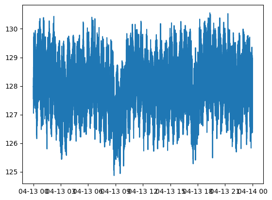
matplotlib本体ではなく、その下のpyplotを呼び出します。横軸が時刻、縦軸がデータの一列目の図を出してみましょう。
pandas では、 iloc[行数, 列数] で Dataframe からデータを抽出することができます。
import matplotlib.pyplot as plt

x = df.index  # x軸: 時刻
y = df.iloc[:, 0]  # データの一列目. 「:」で行すべて選択、「0」で1列目を選択

fig = plt.figure()  # figure オブジェクトの作成
ax = fig.add_subplot(1, 1, 1)  # Axesオブジェクトの作成
ax.plot(x, y)
plt.show()
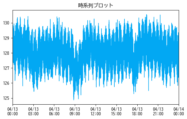
上で示したMatplolibの公式チュートリアルの図のように、Axesオブジェクトは軸や目盛りを持っているため、それぞれにアクセスすることで細かい調整が可能となります。ここでは、図の解像度や色、日本語フォントの埋め込み、時系列データに頻出な時刻目盛りなどを調整します。
# matplotlibで日付のフォーマットを取り扱うモジュールを追加で読み込む
from matplotlib.dates import DateFormatter

# matplotlibでは日本語にデフォルトで対応していないので、日本語対応フォントを読み込む
plt.rcParams["font.family"] = "BIZ UDGothic"  # Windows
# plt.rcParams['font.family'] = 'Hiragino Maru Gothic Pro' # Mac

# その他使えるフォント一覧は以下のコードで取得できます。
# import matplotlib.font_manager
# [f.name for f in matplotlib.font_manager.fontManager.ttflist]

# figureの引数; figsizeで画像のサイズ、dpiで解像度を設定できます。
fig = plt.figure(figsize=(7, 4), dpi=100)
ax = fig.add_subplot(1, 1, 1)

# 線の色や、太さを指定
ax.plot(x, y, color="#02A8F3", linewidth=1.0)

# x軸(xaxis)にアクセスしてフォーマットを調整
ax.xaxis.set_major_formatter(DateFormatter("%m/%d\n%H:%M"))  # 日付を2段組に

# プロットをグラフの限界まで広げる(余計な空白を作らない)
ax.set_xlim(x[0], x[-1])

# タイトルをつける
ax.set_title("時系列プロット")

plt.show()
再利用可能とするため、グラフのプロットをまとめる関数を作成します。
import itertools


def plot_figs(df):
    """
    うけとったデータをすべてプロットする関数
    :param df: plotしたいpandas.Dataframe
    :return:
    """
    color_iter = itertools.cycle(["#02A8F3", "#33B490", "#FF5151", "#B967C7"])
    n_figs = df.columns.size
    fig = plt.figure(figsize=(6, 2.0 * n_figs), dpi=100)
    x = df.index
    for i in range(n_figs):
        y = df.iloc[:, i]
        title = df.columns[i]
        ax = fig.add_subplot(n_figs, 1, i + 1)
        ax.plot(x, y, color=next(color_iter), linewidth=1.0)
        ax.xaxis.set_major_formatter(DateFormatter("%H:%M"))
        ax.set_xlim(x[0], x[-1])
        ax.set_title(title, fontsize=12)
    fig.tight_layout()
    plt.show()
    plt.close()


# 全部をプロットする余白がないので、ここでは一部をプロット
plot_list = [
    "コンプレッサー出口温度_PV",
    "コンプレッサー出口温度_SV",
    "気化器液面レベル_PV",
    "気化器液面レベル_SV",
    "気化器液面レベル_MV",
]
plot_figs(df.loc[:, plot_list])
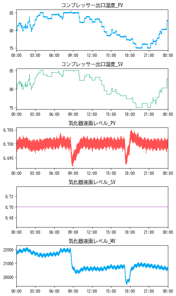
まとめて可視化してみると、これだけでもさまざまな特徴に気づくことができます。例えば、
コンプレッサー出口温度_SVは目標値(SV)なので、出力値(PV)コンプレッサー出口温度_PVが追従して動いている気化器液面レベル_PVは8時30分ごろと17時ごろの挙動に変化がある目標値(SV)である
気化器液面レベル_SVは変化していないが、操作量(MV)である気化器液面レベル_MVは変化していることから、同時刻に他の目標値(SV)が変更され、その影響を吸収するために操作が行われたことが推察される
などがわかります。データ分析をする際はどのようなデータに対しても可視化は必要不可欠です。
小括#
時系列データの基本的なプロット方法を紹介しました。さまざまある可視化ライブラリの中でも、Pythonにおいてはmatplotlibがデファクトスタンダードになっています。紹介した折れ線グラフ以外にもさまざまなプロットに対応しているため、必要に応じて参照してください。
データの可視化によって、数値データからは読み取れなかったさまざまな特徴や情報を得ることができます。これらの解釈にはドメイン知識が必要となりますが、傾向を把握しておくだけも、解析の際の大きな助けになります。